-
-
Save internaut/a9a274c72181eaa7f5c3ab3a5f54b996 to your computer and use it in GitHub Desktop.
| # Plot a network graph of nodes with geographic coordinates on a map. | |
| # | |
| # Author: Markus Konrad <[email protected]> | |
| # May 2018 | |
| # | |
| # This script shows three ways of plotting a network graph on a map. | |
| # The following information should be visualized (with the respective | |
| # aestethics added): | |
| # | |
| # * graph nodes with: | |
| # * position on map -> x,y position of the node | |
| # * node weight (degree of the node) -> node size | |
| # * node label -> also x,y position of the node | |
| # * edges between nodes with: | |
| # * edge weight -> edge width | |
| # * edge category -> edge color | |
| library(assertthat) | |
| library(dplyr) | |
| library(purrr) | |
| library(igraph) | |
| library(ggplot2) | |
| library(ggraph) | |
| library(ggmap) | |
| # -------------------------------------- # | |
| # Preparation: generate some random data # | |
| # -------------------------------------- # | |
| set.seed(123) | |
| N_EDGES_PER_NODE_MIN <- 1 | |
| N_EDGES_PER_NODE_MAX <- 4 | |
| N_CATEGORIES <- 4 | |
| country_coords_txt <- " | |
| 1 3.00000 28.00000 Algeria | |
| 2 54.00000 24.00000 UAE | |
| 3 139.75309 35.68536 Japan | |
| 4 45.00000 25.00000 'Saudi Arabia' | |
| 5 9.00000 34.00000 Tunisia | |
| 6 5.75000 52.50000 Netherlands | |
| 7 103.80000 1.36667 Singapore | |
| 8 124.10000 -8.36667 Korea | |
| 9 -2.69531 54.75844 UK | |
| 10 34.91155 39.05901 Turkey | |
| 11 -113.64258 60.10867 Canada | |
| 12 77.00000 20.00000 India | |
| 13 25.00000 46.00000 Romania | |
| 14 135.00000 -25.00000 Australia | |
| 15 10.00000 62.00000 Norway" | |
| # nodes come from the above table and contain geo-coordinates for some | |
| # randomly picked countries | |
| nodes <- read.delim(text = country_coords_txt, header = FALSE, | |
| quote = "'", sep = "", | |
| col.names = c('id', 'lon', 'lat', 'name')) | |
| # edges: create random connections between countries (nodes) | |
| edges <- map_dfr(nodes$id, function(id) { | |
| n <- floor(runif(1, N_EDGES_PER_NODE_MIN, N_EDGES_PER_NODE_MAX+1)) | |
| to <- sample(1:max(nodes$id), n, replace = FALSE) | |
| to <- to[to != id] | |
| categories <- sample(1:N_CATEGORIES, length(to), replace = TRUE) | |
| weights <- runif(length(to)) | |
| data_frame(from = id, to = to, weight = weights, category = categories) | |
| }) | |
| edges <- edges %>% mutate(category = as.factor(category)) | |
| # create the igraph graph object | |
| g <- graph_from_data_frame(edges, directed = F, vertices = nodes) | |
| # --------------------------------------------------------------------- # | |
| # Common data structures and ggplot objects for all the following plots # | |
| # --------------------------------------------------------------------- # | |
| # create a data frame for plotting the edges | |
| # join with nodes to get start and end positions for each | |
| # edge (x, y and xend, yend) | |
| edges_for_plot <- edges %>% | |
| inner_join(nodes %>% select(id, lon, lat), by = c('from' = 'id')) %>% | |
| rename(x = lon, y = lat) %>% | |
| inner_join(nodes %>% select(id, lon, lat), by = c('to' = 'id')) %>% | |
| rename(xend = lon, yend = lat) | |
| assert_that(nrow(edges_for_plot) == nrow(edges)) | |
| # use the node degree for scaling the node sizes | |
| nodes$weight = degree(g) | |
| # common plot theme | |
| maptheme <- theme(panel.grid = element_blank()) + | |
| theme(axis.text = element_blank()) + | |
| theme(axis.ticks = element_blank()) + | |
| theme(axis.title = element_blank()) + | |
| theme(legend.position = "bottom") + | |
| theme(panel.grid = element_blank()) + | |
| theme(panel.background = element_rect(fill = "#596673")) + | |
| theme(plot.margin = unit(c(0, 0, 0.5, 0), 'cm')) | |
| # common polygon geom for plotting the country shapes | |
| country_shapes <- geom_polygon(data = map_data('world'), aes(x = long, y = lat, group = group), | |
| fill = "#CECECE", color = "#515151", size = 0.15) | |
| # common coordinate system for all the following plots | |
| mapcoords <- coord_fixed(xlim = c(-150, 180), ylim = c(-55, 80)) | |
| # ------------------------------- # | |
| # Solution 1: ggplot + ggmap only # | |
| # ------------------------------- # | |
| # try to plot with scaled edge widths and node sizes | |
| # this will fail because we can only use the "size" aesthetic twice | |
| ggplot(nodes) + country_shapes + | |
| geom_curve(aes(x = x, y = y, xend = xend, yend = yend, # draw edges as arcs | |
| color = category, size = weight), | |
| data = edges_for_plot, curvature = 0.33, alpha = 0.5) + | |
| scale_size_continuous(guide = FALSE, range = c(0.25, 2)) + # scale for edge widths | |
| geom_point(aes(x = lon, y = lat, size = weight), # draw nodes | |
| shape = 21, | |
| fill = 'white', color = 'black', stroke = 0.5) + | |
| scale_size_continuous(guide = FALSE, range = c(1, 6)) + # scale for node size | |
| geom_text(aes(x = lon, y = lat, label = name), # draw text labels | |
| hjust = 0, nudge_x = 1, nudge_y = 4, | |
| size = 3, color = "white", fontface = "bold") + | |
| mapcoords + maptheme | |
| # Results in warning: "Scale for 'size' is already present. Adding another scale for | |
| # 'size', which will replace the existing scale." | |
| # now a plot with static node size: | |
| ggplot(nodes) + country_shapes + | |
| geom_curve(aes(x = x, y = y, xend = xend, yend = yend, # draw edges as arcs | |
| color = category, size = weight), | |
| data = edges_for_plot, curvature = 0.33, alpha = 0.5) + | |
| scale_size_continuous(guide = FALSE, range = c(0.25, 2)) + # scale for edge widths | |
| geom_point(aes(x = lon, y = lat), # draw nodes | |
| shape = 21, size = 3, | |
| fill = 'white', color = 'black', stroke = 0.5) + | |
| geom_text(aes(x = lon, y = lat, label = name), # draw text labels | |
| hjust = 0, nudge_x = 1, nudge_y = 4, | |
| size = 3, color = "white", fontface = "bold") + | |
| mapcoords + maptheme | |
| # ------------------------------------ # | |
| # Solution 2: ggplot2 + ggmap + ggraph # | |
| # ------------------------------------ # | |
| # prepare layout: use "manual" layout with geo-coordinates | |
| node_pos <- nodes %>% select(lon, lat) %>% rename(x = lon, y = lat) | |
| lay <- create_layout(g, 'manual', node.positions = node_pos) | |
| assert_that(nrow(lay) == nrow(nodes)) | |
| # use the node degree for scaling the node sizes | |
| lay$weight <- degree(g) | |
| ggraph(lay) + country_shapes + | |
| geom_edge_arc(aes(color = category, edge_width = weight, # draw edges as arcs | |
| circular = FALSE), | |
| data = edges_for_plot, curvature = 0.33, alpha = 0.5) + | |
| scale_edge_width_continuous(range = c(0.5, 2), # scale for edge widths | |
| guide = FALSE) + | |
| geom_node_point(aes(size = weight), shape = 21, # draw nodes | |
| fill = "white", color = "black", | |
| stroke = 0.5) + | |
| scale_size_continuous(range = c(1, 6), guide = FALSE) + # scale for node widths | |
| geom_node_text(aes(label = name), repel = TRUE, size = 3, | |
| color = "white", fontface = "bold") + | |
| mapcoords + maptheme | |
| # --------------------------------------------------------------- # | |
| # Solution 3: the hacky way (overlay several ggplot "plot grobs") | |
| # --------------------------------------------------------------- # | |
| theme_transp_overlay <- theme( | |
| panel.background = element_rect(fill = "transparent", color = NA), | |
| plot.background = element_rect(fill = "transparent", color = NA) | |
| ) | |
| # the base plot showing only the world map | |
| p_base <- ggplot() + country_shapes + mapcoords + maptheme | |
| # first overlay: edges as arcs | |
| p_edges <- ggplot(edges_for_plot) + | |
| geom_curve(aes(x = x, y = y, xend = xend, yend = yend, # draw edges as arcs | |
| color = category, size = weight), | |
| curvature = 0.33, alpha = 0.5) + | |
| scale_size_continuous(guide = FALSE, range = c(0.5, 2)) + # scale for edge widths | |
| mapcoords + maptheme + theme_transp_overlay + | |
| theme(legend.position = c(0.5, -0.1), legend.direction = "horizontal") | |
| # second overlay: nodes as points | |
| p_nodes <- ggplot(nodes) + | |
| geom_point(aes(x = lon, y = lat, size = weight), | |
| shape = 21, fill = "white", color = "black", # draw nodes | |
| stroke = 0.5) + | |
| scale_size_continuous(guide = FALSE, range = c(1, 6)) + # scale for node size | |
| geom_text(aes(x = lon, y = lat, label = name), # draw text labels | |
| hjust = 0, nudge_x = 1, nudge_y = 4, | |
| size = 3, color = "white", fontface = "bold") + | |
| mapcoords + maptheme + theme_transp_overlay | |
| # combine the overlays to a full plot | |
| # proper positioning of the grobs can be tedious... I found that | |
| # using `ymin` works quite well but manual tweeking of the | |
| # parameter seems necessary | |
| p <- p_base + | |
| annotation_custom(ggplotGrob(p_edges), ymin = -74) + | |
| annotation_custom(ggplotGrob(p_nodes), ymin = -74) | |
| print(p) | |
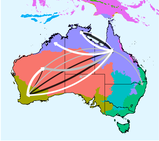
Hi, many thanks for the awesome script. I'm using it to show migration routes in Australia. However, I am trying to let the curves not start/end in the specified locations to make it easier for the reader to see where the arrows go. I tried a lot but nothing quite seems to work. I used the hacky way to accomplish the below plot (Solution 3). Any help is highly appreciated.
2022 here: For anyone else getting an error on node.positions, it seems to be a breaking change since this version (from 2018). I changed "node.positions" to "layout" in the code which helped.
Another error for the ggraph (method number 2 here) also gave an error that it could not find the object "edge.id". I just added that column manually to the edges_for_plot dataframe before running the geom_edge_arc like this:
edges_for_plot$edge.id <- c(1:38) #so now it has a column edge.id
Then ran the final ggraph plot:
ggraph(lay) + country_shapes +
geom_edge_arc(aes(color = category, edge_width = weight, # draw edges as arcs
circular = FALSE),
data = edges_for_plot, strength = 0.33, ###curvature is apparently changed to strength in the new ggraph version
alpha = 0.5) # and you can add the rest of the options in the original code here
Very helpful! Is there a way to control the position of arrows, say put it at the middle of a line? This can avoid too many arrows overlaying with each other when they point to the same location. Thanks!
very helpful. like it. thank you very much.