There have been quiet a few posts on plantuml(1, 2) and don't get me wrong I quiet liked it myself (here's one I wrote). But let's face it, the diagrams aren't pretty, and it lacks visual componants from popular platforms like AWS icons, SASS providers etc. And while you can add custom features to plantuml using stylesheets, it's really not fun.
In comes Diagrams, a python library which is feature rich.
Here's an exmaple, lifted right out of the documentation-
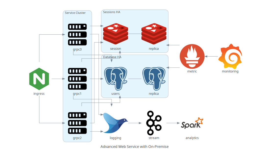
from diagrams import Cluster, Diagram
from diagrams.onprem.analytics import Spark
from diagrams.onprem.compute import Server
from diagrams.onprem.database import PostgreSQL
from diagrams.onprem.inmemory import Redis
from diagrams.onprem.logging import Fluentd
from diagrams.onprem.monitoring import Grafana, Prometheus
from diagrams.onprem.network import Nginx
from diagrams.onprem.queue import Kafka

with Diagram("Advanced Web Service with On-Premise", show=False):
    ingress = Nginx("ingress")

    metrics = Prometheus("metric")
    metrics << Grafana("monitoring")

    with Cluster("Service Cluster"):
        grpcsvc = [
            Server("grpc1"),
            Server("grpc2"),
            Server("grpc3")]

    with Cluster("Sessions HA"):
        master = Redis("session")
        master - Redis("replica") << metrics
        grpcsvc >> master

    with Cluster("Database HA"):
        master = PostgreSQL("users")
        master - PostgreSQL("slave") << metrics
        grpcsvc >> master

    aggregator = Fluentd("logging")
    aggregator >> Kafka("stream") >> Spark("analytics")

    ingress >> grpcsvc >> aggregator